How to Сreate the Best Custom Real Estate Design?
Due to COVID-19, the property market was supposed to be falling into decay. Therefore, real estate web design took a back seat, yet everything has changed after the global lockdown that occurred in the spring of 2020. There is no crash – the market is in the recovery phase. Nowadays, specialists are comparing the sales level of houses with the pre-pandemic times. For example, the demand for real estate in the US is hitting up. The same could be said about prices and sales level. The average home cost in the US for the first time exceeded 300.000 $ in July. Therefore, real estate agencies are stepping up their efforts to revive their sales. And with a selling website at their disposal, companies can easily attract new clients. Nonetheless, the question remains: What are the requirements real estate website design must meet? First of all, it should comply with the following criteria:
- Be visually appealing.
- Be usable.
- Be fast loading.
- Be adaptable to the user’s device.
- Be simple and clear in terms of navigation.
- Include an efficient call to action.
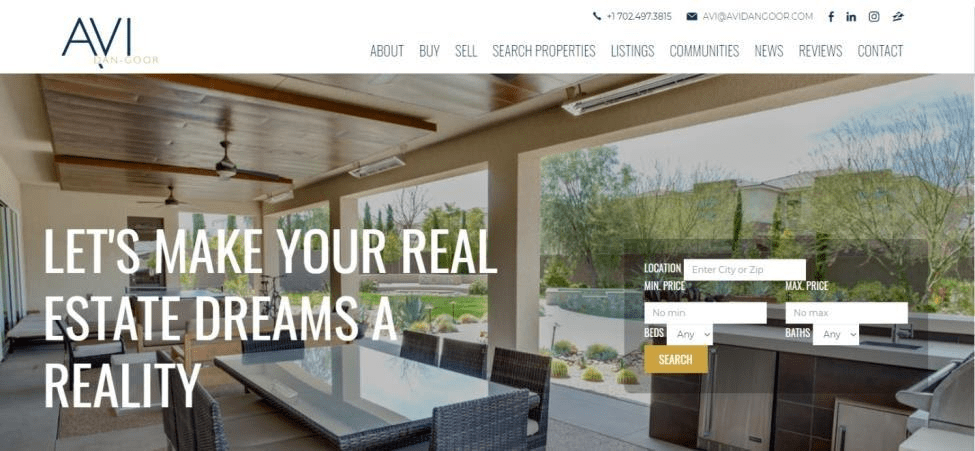
Note: Rarely can website design be considered separately, so to grasp the full concept of real estate website development, you can get acquainted with our complete guide.
Real Estate Site Design – Influencing Factors
Before a project realization company should decide, which main goals it follows. Perhaps, the main aim is to make a virtual excursion for visitors and get them to come for an inspection of the property. But still, there are lots of other tasks which can be solved with the competently constructed website:
- Building the trusty atmosphere between the company and the buyer.
- Strengthening of the brand’s position.
- Making the tour for the visitors. It could be organized in 3D format.
- Showing the layouts of the building, its advantages, and peculiarities.
Some sites become a real inspiration because of an amazing design. At the same time, there are such examples of web pages which could spook a potential buyer.
NOTE: To make useful, well-balanced website developers and designers should think about visitor demands. Before starting the development and building the custom real estate website design they must pay attention to simple questions. How can visitors complete their own tasks while visiting the web-site? Which experience will the user receive and how to make it positive?
Let’s take a closer look at spectacular real estate websites and find out the main implementation secrets.
Best Real Estate Website Design Examples
The construction of sites depends on business needs. For example, real estate developers, agents, brokers as usual have fundamentally different needs. These needs should be taken into account by the team which is developing a website. But there is one general rule for all customers. It should read: the website for selling or just presenting real estate is required to be full of incredible images. Therefore, the first step is to find a professional photographer. This rule doesn’t work only in one case when the object isn’t finished yet. But there are other literate decisions for such a situation.
Here are 11 examples of the custom commercial real estate website design which are related to internal and external tours and have obvious advantages over the competitors, because give visitors a unique possibility to have a guided tour.
1. SALLY FORSTER JONES GROUP
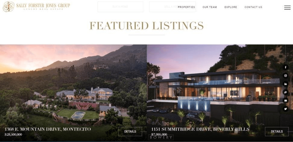
While visiting this website, we can find at least a few important features. The main one is the video sequence that meets visitors on the main page. Dynamic luxury views create the right atmosphere. The same videos are prepared for all properties.
These videos do not take attention away from the proposition and complement the call to action. They harmonize with fonts and general vision.
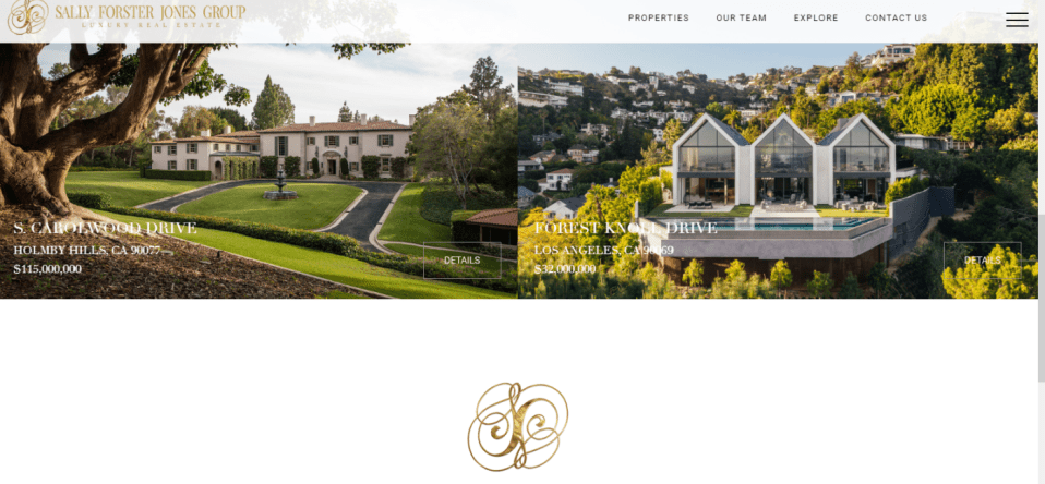
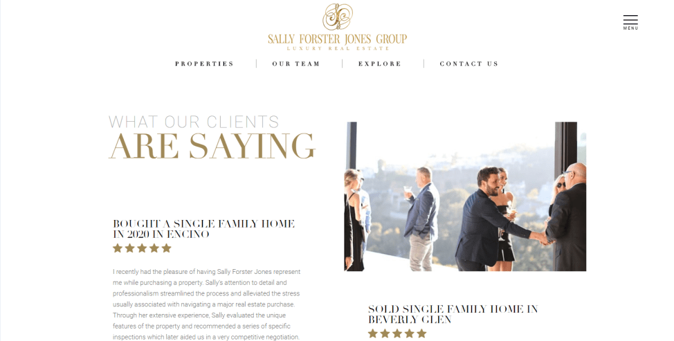
The web-page is adaptive. It’s obvious because the biggest part of potential buyers and sellers use smartphones to visit a website with real estate. Particular attention is paid to feedback. You can see the section which is devoted to testimonials – What Our Clients Are Saying. It increases customer loyalty.
2. Cedar Bay Villas
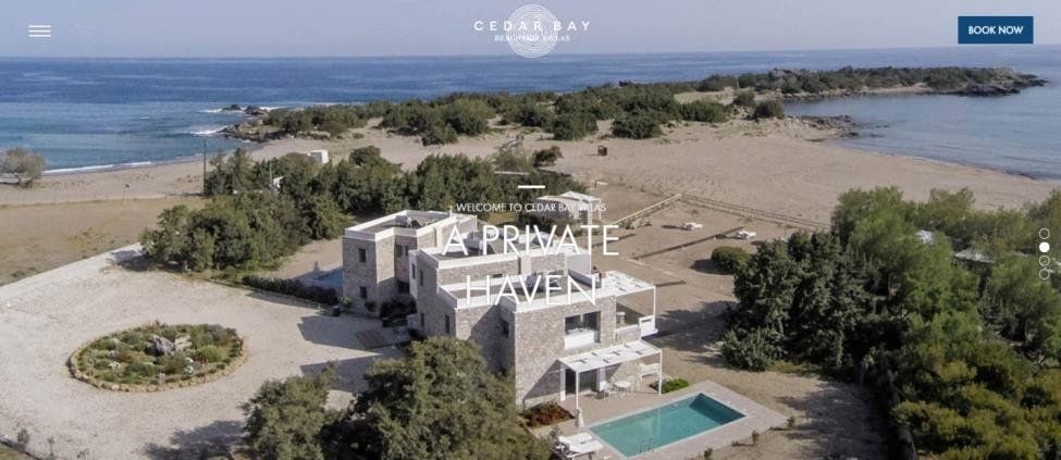
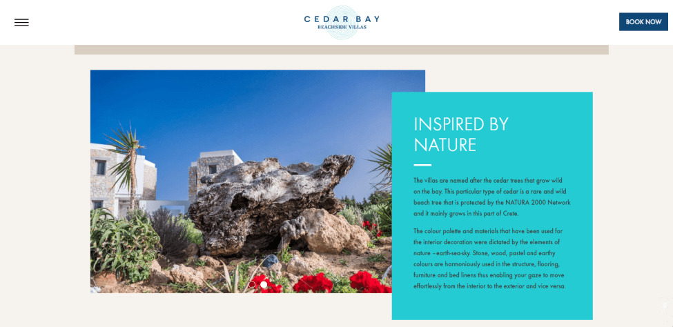
This site is dedicated to private villas in different locations. It’s one of the simplest projects, which is realized on WordPress. The main aim of the creators is to show advantages of such a proposition: beautiful nature, outstanding views, lots of possibilities for activities, and amazing accommodation. Here is an example of a simple, but impressive real estate web design with logic call to action.
3. Furnished NYC Apartments
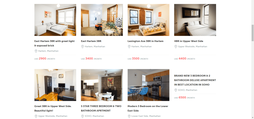
The best real estate website design should conform to user convenience and simultaneously address the company’s challenges. There is no need to create a difficult, overworked site. It has been proven by Furnished NYC Apartments. The company has a clear, user friendly and intuitive web interface.
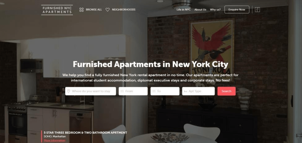
The best propositions are unified in the section “Deals of the week”, which makes the search comfortable and enjoyable for visitors.
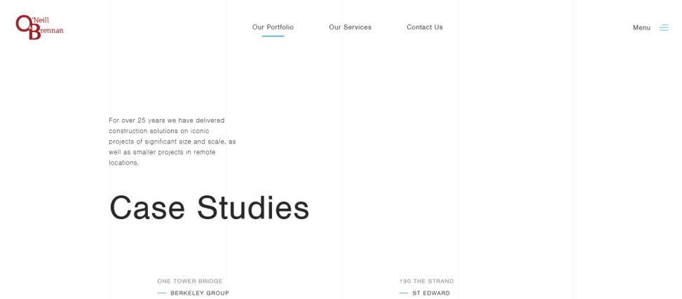
4. O’Neill & Brennan
The company specializes in construction logistic. Therefore, the main aim for designers and developers was to show a high level of expertise, the wealth of experience, and typical solutions.
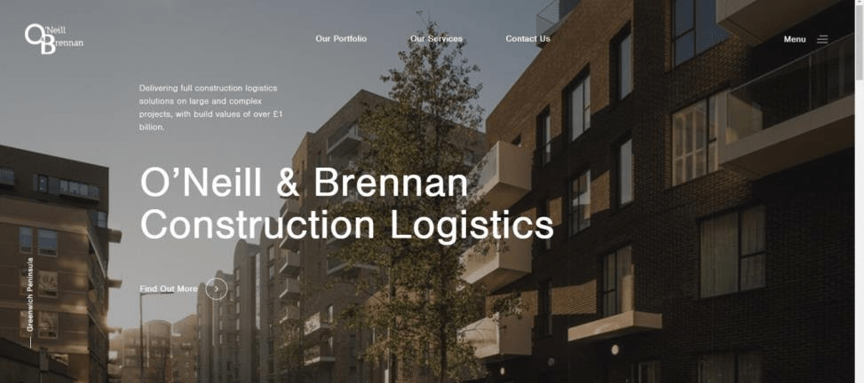
Considerable attention was paid to prepare bright pictures, sections connected to portfolio and services.
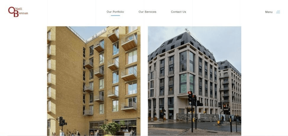
Logotype turned out to be very simple, but notable. It’s a wonderful addition for real estate web design.
5. CAPITAL PACIFIC
It’s a bright example of how to implement in practice a virtuous commercial real estate website design. They tried to recreate the sense of trust and individual approach.
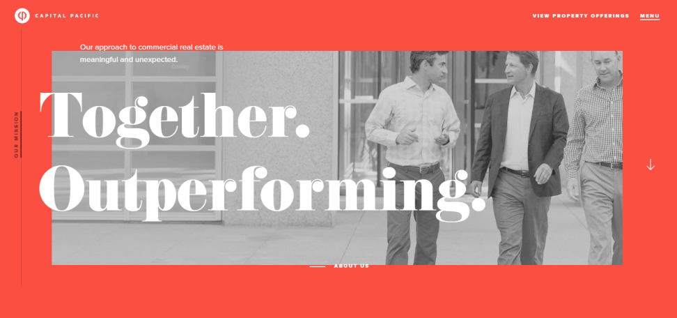
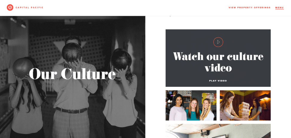
Bright colors here are compared with calm shades of white, black, and grey. Site is adaptive and includes an extensive menu. One of the most noteworthy items tells about CENTRAL PACIFIC story. It highlights the benefits of working with a company. High level of expertise, convenient collaboration, and communication are emphasized.
6. ELLIS PARTNERS
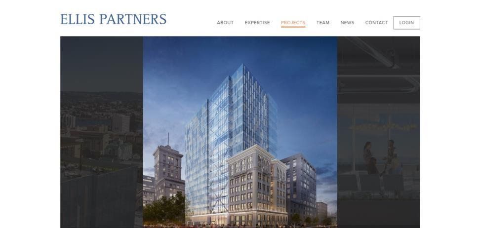
Development and investment real estate company “ELLIS PARTNERS” has been working in this area for almost 30 years. This was emphasized in design, which looks simple, but well-balanced, and fully meets the requirements of the customer.
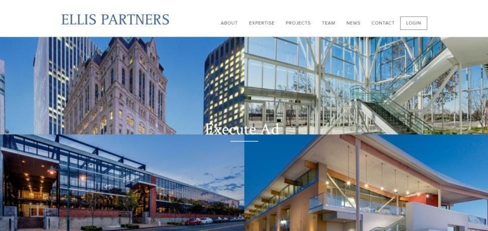
The specific menu item is dedicated to projects that have been implemented. Each project is accompanied by a photo selection and a short description.
7. Alabama Association of Realtors
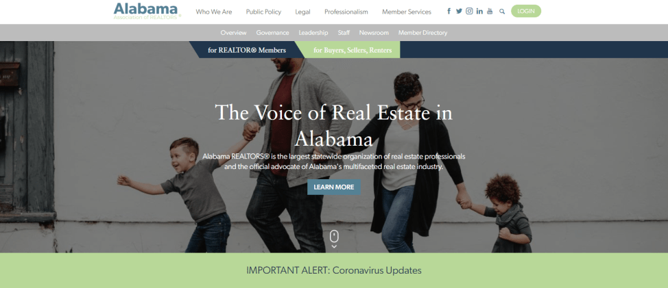
The structure of the real estate web design should be instantly clear and simple. Designers strictly follow that rule while creating websites. Elegant fonts and the right color combination, which consists of white, mint and blue, make it pleasant for eyes.
8. Kidder Mathews
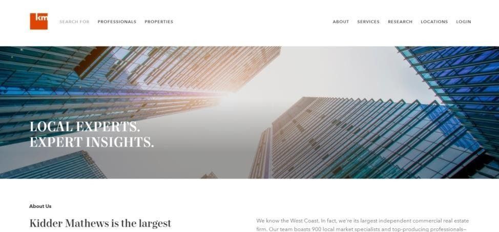
This company is one of the largest on the West Coast, which deals with big projects, that’s why one-pager doesn’t correspond to its needs. It was decided to build a fully functional site with lots of pages.
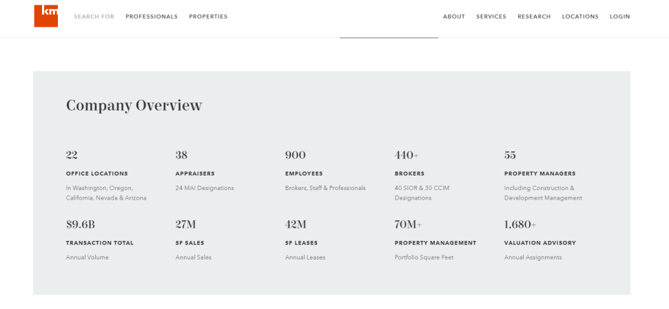
One section is devoted to company achievements. The collected statistics can help visitors to understand the scope and extent of “Kidder Mathews”.
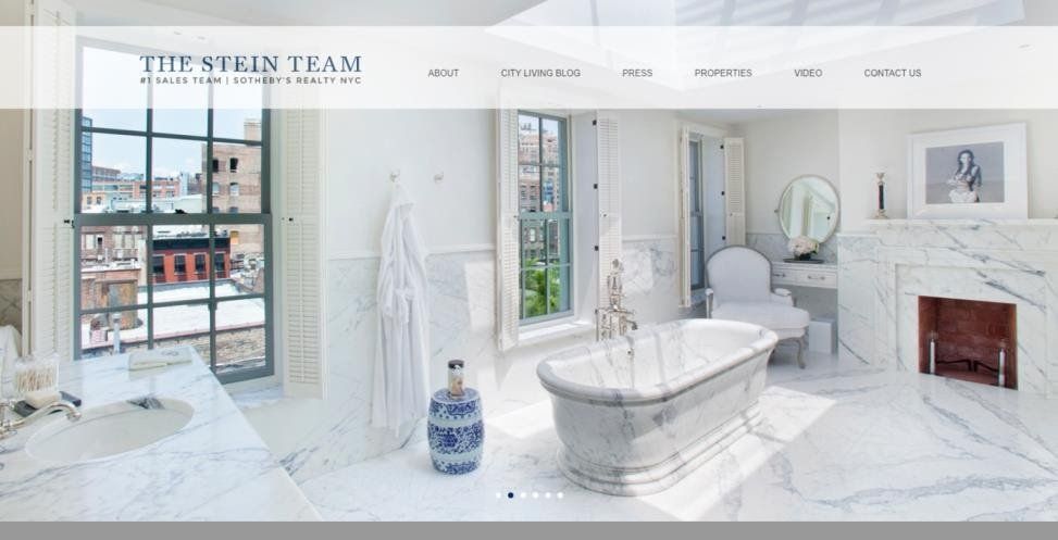
9. The Stein Team
The real estate site design includes a whole carousel of pictures instead of one image. It’s a good idea, because static shots can be boring for visitors. Sometimes this is accompanied by slow page downloading, but in the particular case the problem was avoided. Using sections with video and blog are useful for SEO. Also, they help to increase customer loyalty.
10. The Oppenheim Group
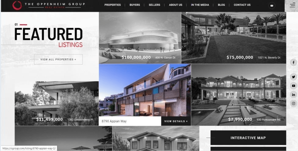
Thanks to a vivid presentation site can indeed become one of the most popular in its intended market. The webpage of Oppenheim Group proves it.
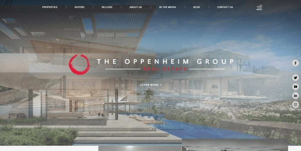
The benefits of such design include:
- Understandable navigation.
- Well-formulated commercial suggestion.
- Visual visibility.
- Literate sorting of the real estate.
- Adaptability to the needs of sellers and buyers, which helps to categorize new visitors.
11. Greg Noonan & associates
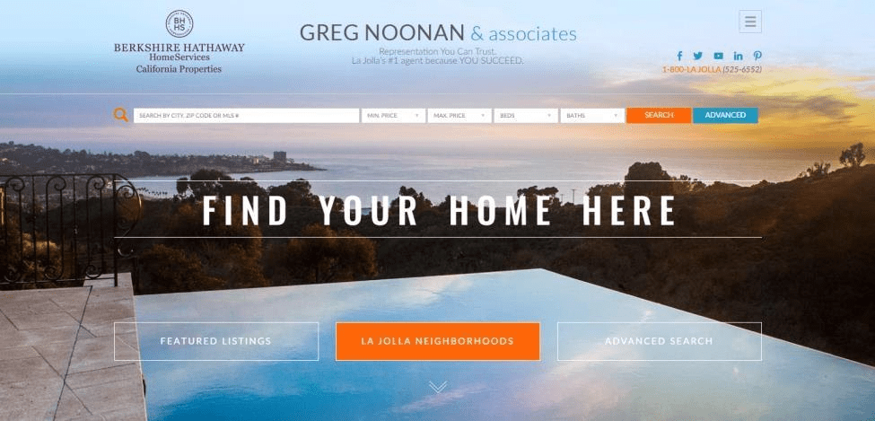
The website is based on the idea of unifying all the important items on the homepage. A visitor can find categorized filters and search bar here. Such an approach helps to build user-friendly real estate web design. It’s directly connected to the number of new customers.
What Mistakes Real Estate Website Design Companies Make
If designers and developers teams are separated or do not cooperate with business representatives, the site might happen to become a great failure. This is proven by the fact that thousands of visitors, who can become clients, but decide to leave the web-page, are complaining about typical problems:
- Incomprehensible navigation.
- Overloaded menu.
- Bugs.
- Dead links.
- Long-term loading.
All these typical problems lead to leaving the web-page. For example, nearly 47% of visitors are leaving the site when it loads more, then two seconds. As a result, we’re receiving a reduction in leads and conversion.
Crucial Components of Real Estate Site Design
The UX design should meet the expectations of the visitor:
- Be consistent (all the elements must be compatible, keep the external appearance and the position on each page).
- Be intuitive (there are general rules of design elements, such as buttons, unvisited and visited links, forms, etc.)
- Be well-structured (any site needs literate coherent interconnection between sections and pages).
- Be user-friendly (general design and presentation of different pages must be pleasant for the visitor; if they provoke rejection, potential customers close the page).
High-performance design for real estate website can be fruitful, brings more visitors who can be performed into customers. An important issue that should be worked out by a team of designers and developers is navigation. Here are some interesting ideas that could help real estate website design companies to make the menu clear and visual:
- Try a sticky fixed menu which is always located at the top of the page. Such a choice provides users an opportunity to navigate between pages, even while scrolling the page.
- Perhaps, an old, but still an actual variant of the menu will fit your requirements. This element is called “Breadcrumbs”. It helps the user to understand the current location on the website.
- A logo can become a link for the homepage. If the user is browsing the homepage at the moment, pushing the logo will refresh it.
Custom web design for real estate agencies s necessarily includes the page “About Company”. It should be dedicated to the business story, advantages of cooperation, testimonials, which increase the loyalty level. Adding an interesting story or video about the company, its specialization and advantages is also a good idea.
Some other tips will help to build flawless or almost flawless custom commercial real estate web design:
- Flexible search options are required attributes for the site, where the real estate catalog is presented. Keep in mind, that for those people, who are looking for the house, a lot of details are important. They want to find accommodation in accordance with all their own requirements and wishes. Also, users are fond of using search by keywords. In the result, potential customers want to find the house or flat with needed peculiarities, advantages.
- It’s quite an interesting idea to combine different types of the search. For example, a simple bar with few options on the main page and full search with advanced filters on the other.
- The number of people who visit website using smartphones is growing, that’s why real estate website design with mobile-first approach could be useful.
- Use call to actions. Independent statistics shows that it yields results for custom real estate web design. For example, the conversion growth rate is at least 200%. Even if put only one call to action in the visible location on the main page, conversion will increase by a minimum of 10%.
- The design of forms, links, and buttons must be balanced and fixed up in compliance with general rules. It’s important to make clear calls to actions, use powerful verbs in them, be creative, take into consideration the device, which is used by a visitor.
- Ghost button design still works. It can correspond to the needs of the common vision. The main idea is to find a nice location for such buttons, where they can attract more customers and increase conversion. Experienced designers submit that ghost buttons are indispensable when you don’t want to distract visitors from the other elements. They help visitors to make the right choice.
Designers can use extraordinary approaches to make brand prosperous and lead business. For example, a unique parallax scrolling or 3D-elements which let them stand out from other sites. When considering different styles of real estate web design, we can consider numerous directions. The first one is minimalism. It’s the right one when you need to focus attention on the little details like images or company features.
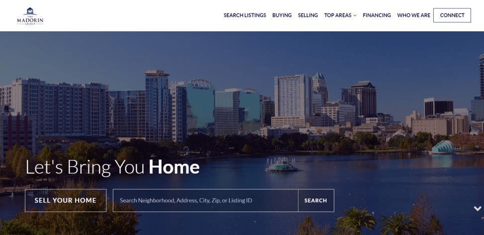
There are also other styles which could be followed in real estate website design. But still, designers should be careful with complicated animations because they can slow down the process of downloading.
To sum up, the real estate web design should be prepared by professionals who understand the peculiarities and needs of the business and can transform them into the fascinating UX/UI design.


